Creating displays is a fun challenge for me! When furniture sells I have to quickly put together a new arrangement.
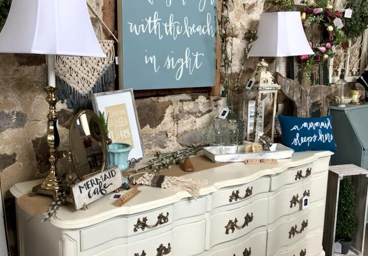
Some are easier than others. Here I knew I wanted to place the floral wall art above the dresser because I had the blue & white vases. So my first tip is: Select colors that go together. This is harder to explain because it really is like art, which is subjective.
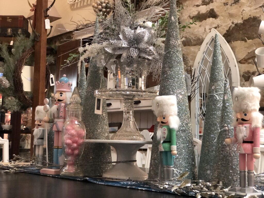
We have a high ceiling in our front “showroom” so I try to create a tall display on the dining set we usually have in there. This vignette was all about a snowy/wintry magical scene like in the Nutcracker Ballet. This was a fun one to put together. Well, they are all FUN but this one was a bonus because we are a Nutcracker Ballet family.
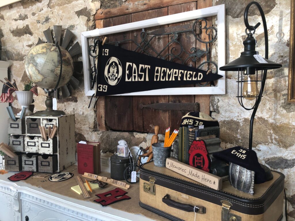
This may have been one of the most unique vignettes I’ve ever put together! It was, of course, August and I decided I could put something very vintage together for “Back to School.” The key here was the “East Hempfield” pennant which anchored it all together otherwise it may have just looked like a bunch of random things strewn together. It may still look like that to you! Ha!
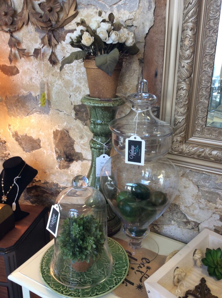
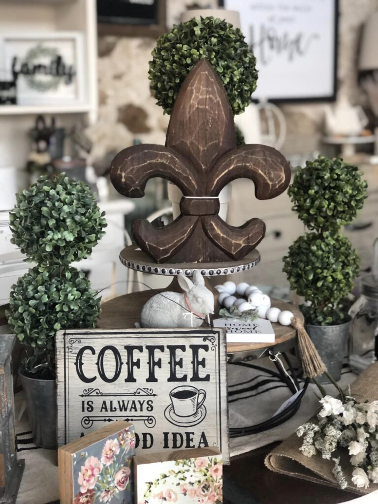
Here I gathered a few of our green decor items and noticed I could pull together three distinct height differences which created a place for your eyes to land. Somehow a group of three anchors the display together.
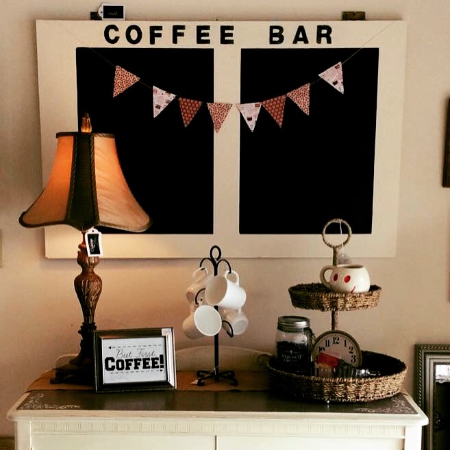
Some of these displays were from our early days in the shop. I still love this one. The coffee bar chalkboard was so cool!
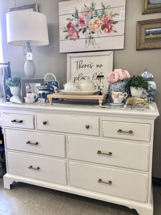
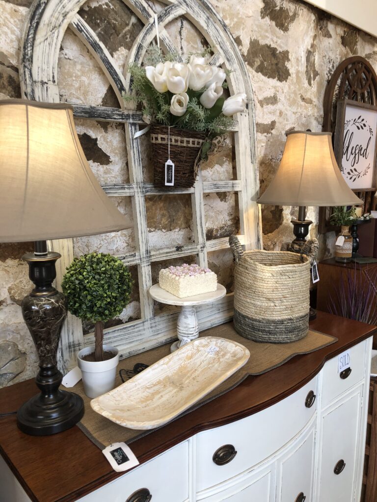
Here I used the “chalkboard wall art” as a background to set up the display as a coffee bar and then I added in my fun coffee-themed pieces. The lamp created height on the left and the two-tiered tray created height on the right. So tip number three would be: Add items that create height & balance. Your eyes like to see harmony in the world and when I can, I try to set up items this way.
Same idea here. This picture was taken in our first year of the shop. Here you see the same height and balance theory. And when I say theory, I mean, “Jill’s Theory of Decorating.” I have not actually studied interior design. I did work in a beautiful antique mall for a few years and I watched the lovely displays the owner would create and I think I learned a lot from her.
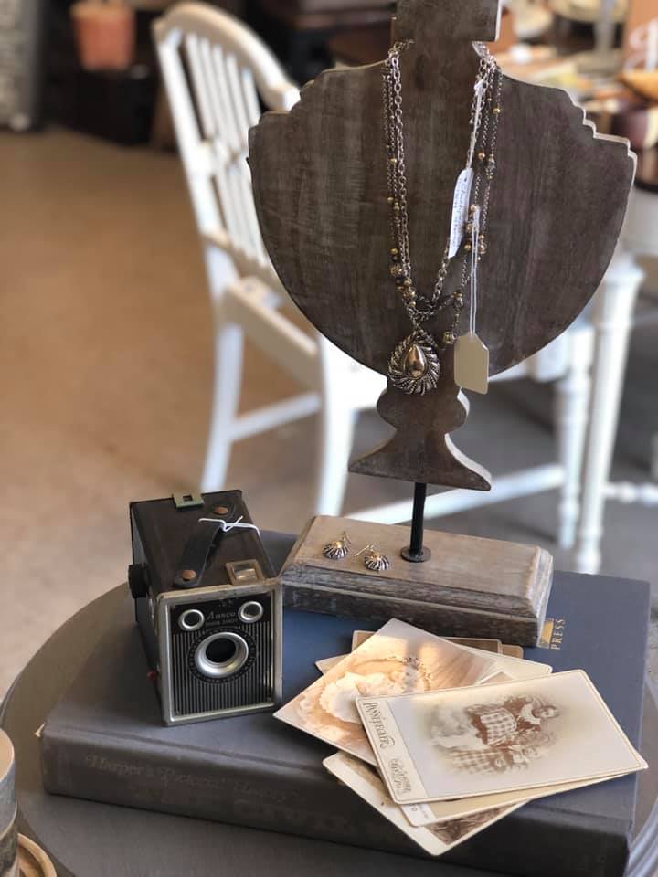
This was a fun display. We have this antique East Lake style dresser from the mid 1800’s and it really inspired me to create an old vintage feel by using an old photograph as the focal point. So I guess tip number four would be: Find something to use as your inspiration piece.
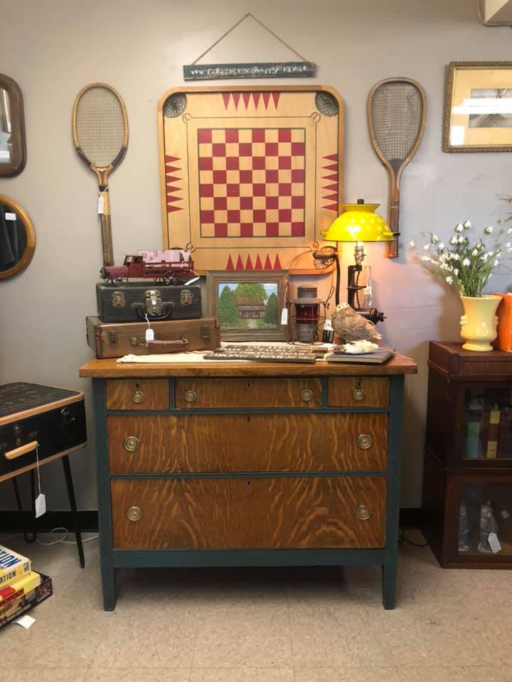
This display was inspired by the game board and old tennis racquets. I was going for an “at the cabin” kind of vibe. I even used one of Bill Clark’s paintings of an old rustic cabin to build upon that theme. So tip number 5 would be: Think out of the box and go for ideas that may not always be “pretty.” You’ll be surprised by what your imagination comes up with!
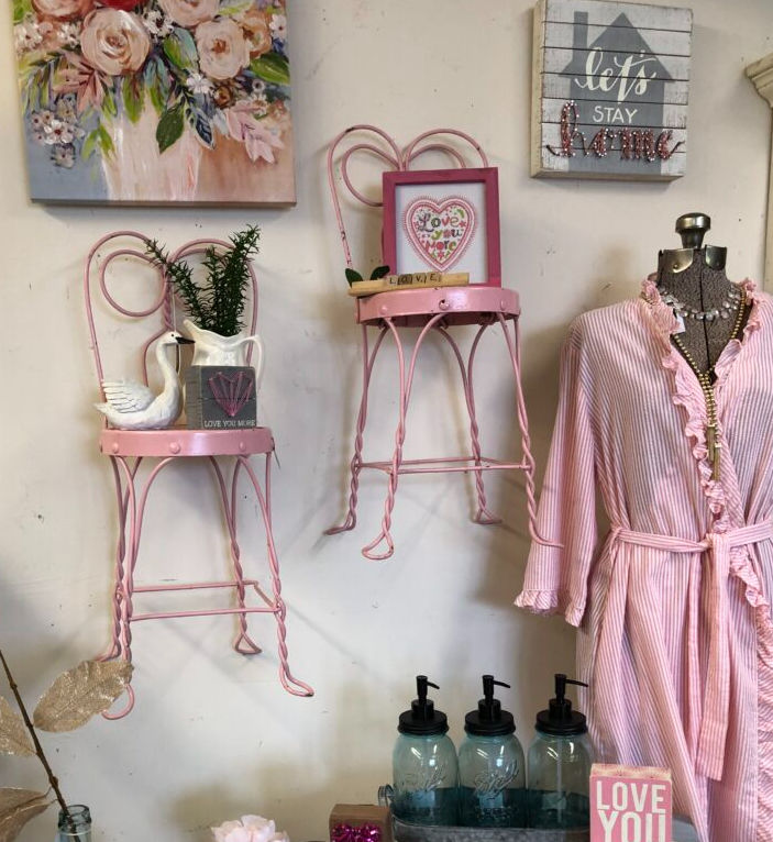
Talk about thinking out of the box… I love the child-size parlor chairs on the walls as shelves! I wasn’t sure how it would look at first but after I hung them on the wall I really liked it! Tip number six: Be Creative! Go for that funky idea, it might pay off.
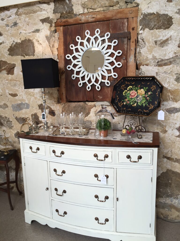
Matching lamps on a buffet or dresser is ALWAYS an eye-catcher! Tip number seven! Matching lamps.
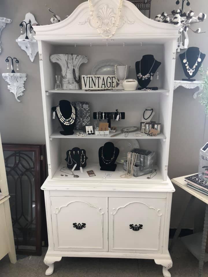
Sometimes the idea turns into another idea… like here I decided to use only black, white, and gray items in this cabinet. When I took the photo I realized it almost has a “Black and white photography” look to it. (If I could redo this photo I would remove the farmhouse cotton stems! I must have originally started with a farmhouse theme and then switched to a “Hollywood Glamour” style.) But anyway, tip number eight: Your display can lead to another display idea… don’t be afraid to switch. Follow your inner decorator and just let it flow!
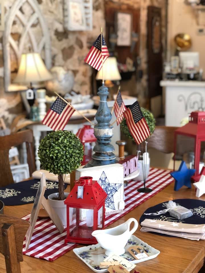
I love making a patriotic red, white, and blue display. It’s synonymous with summer, which is really my favorite time of year. Here I was very fortunate to have found this cool repurposed flag stand and then I just gathered all things red, white, and blue. So what is the tip here? Well, sometimes you can have a little too much of the R/W/B so a little bit of greenery softens it up. So tip number nine is: Add greenery to your vignette, to help offset the color theme. How will you know, you ask? You’ll know, trust me. Plus here is where the height of the topiary trees helped with the height of the flag stand.
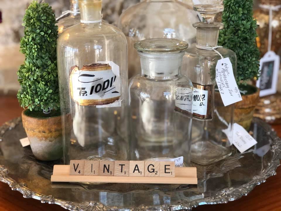
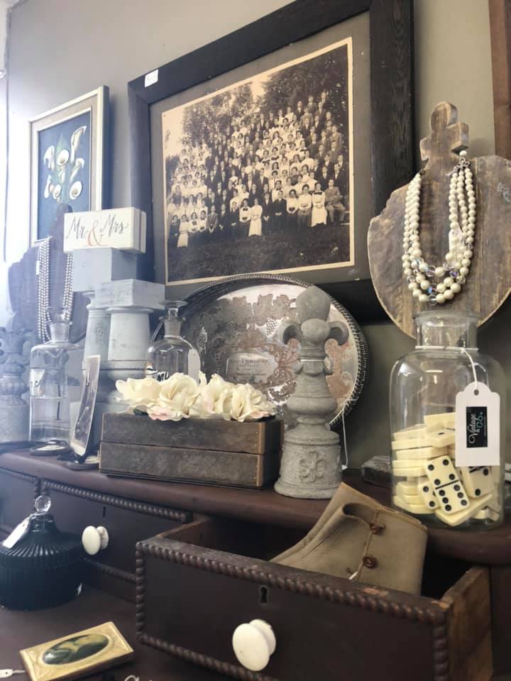
And last but not least, tip number ten, group similar items together, especially if they are vintage. It’s an instant collection, an interesting gathering. People are drawn to antiques because they fascinate us so this works really well with old stuff… try to add something vintage to your display. (This may be tip number eleven but I am trying to stick with an even number like ten!)
I hope you enjoyed this post… I almost didn’t finish it because I really feel like I am putting my inner artist out there. I am probably going to get criticized for my amateur ideas but, hey, if you can get something out of it, then great! Stop back again next month for another post from Vintage & Co.! Until then, follow along with our social media on Facebook and Instagram, and thank you for supporting our small business.